Tredence · UX Designer · Enterprise B2B SaaS · Multi-Cloud Cost Management Platform
Cloud Cost Monitoring Platform
I designed a multi-cloud cost monitoring platform that helped enterprise teams move from reactive reporting to proactive savings.
Challenge
Enterprise cloud teams managing $13M+ in annual spend were flying blind across fragmented dashboards. They needed real-time visibility, proactive alerts, and trustworthy AI recommendations across AWS, GCP, and Azure.
40%
cost savings through recommendations
67%
reduction in budget overruns
85%
weekly active usage
$2.1M
combined annual savings
Illustrative artifacts
A product story with tangible surfaces.
These panels explain the design decisions around the supplied project surfaces.
Unified dashboard
Illustrative portfolio artifact based on the case-study narrative, not a direct client screenshot.
Cost prevention loop
Illustrative portfolio artifact based on the case-study narrative, not a direct client screenshot.
AI recommendation trust
Before
Hidden recommendations tab
After
Top savings widget with evidence
Illustrative portfolio artifact based on the case-study narrative, not a direct client screenshot.
Product surfaces
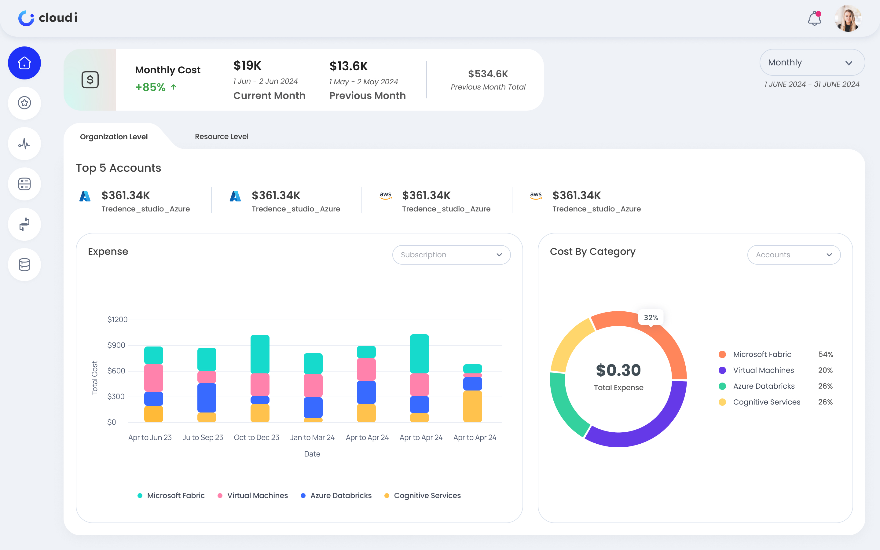
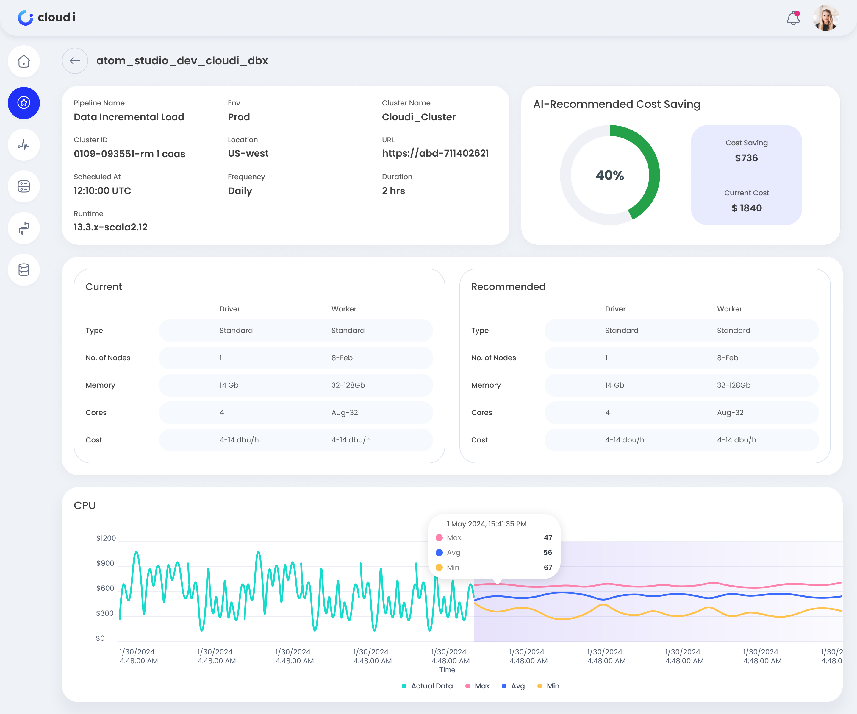
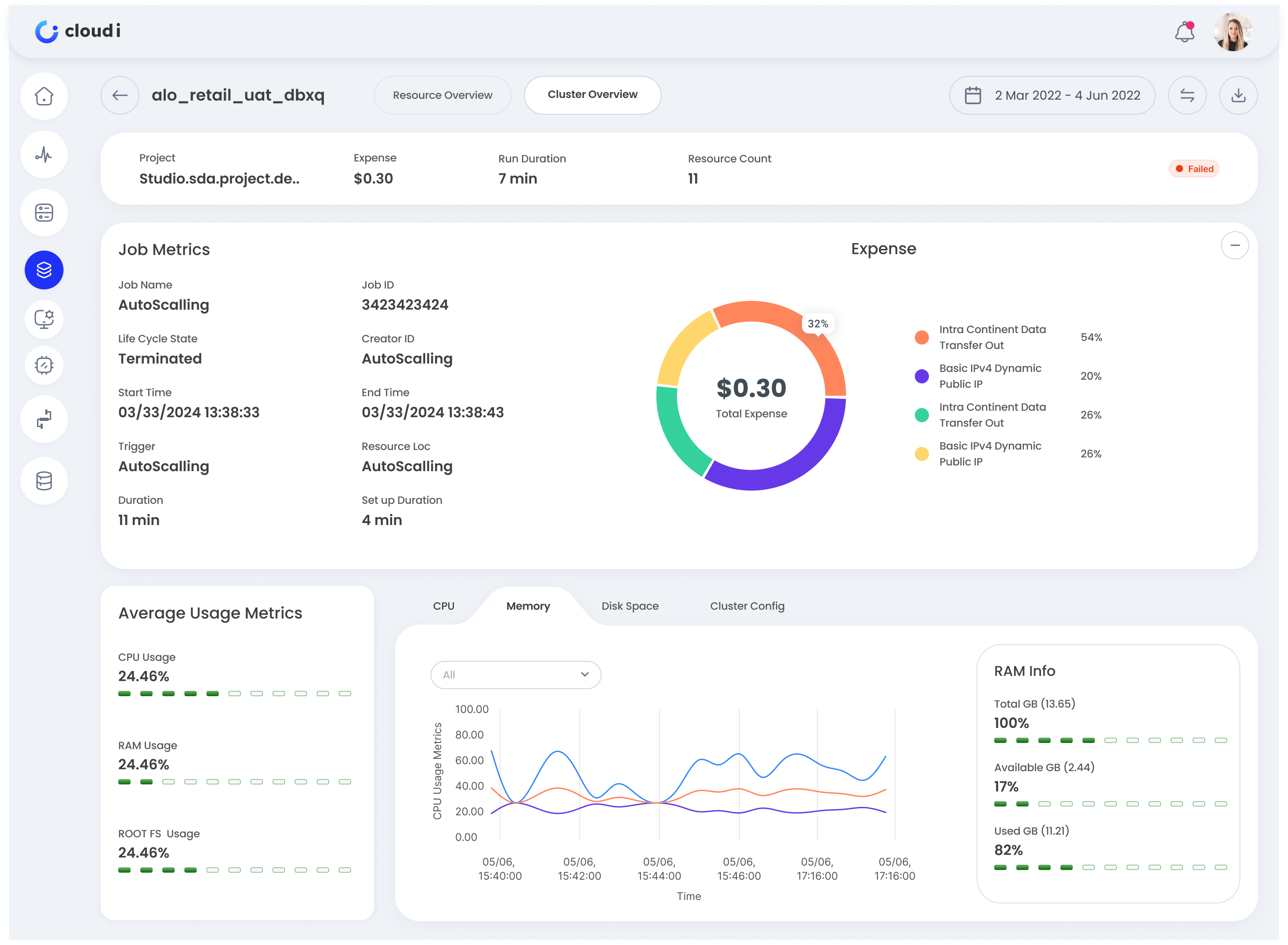
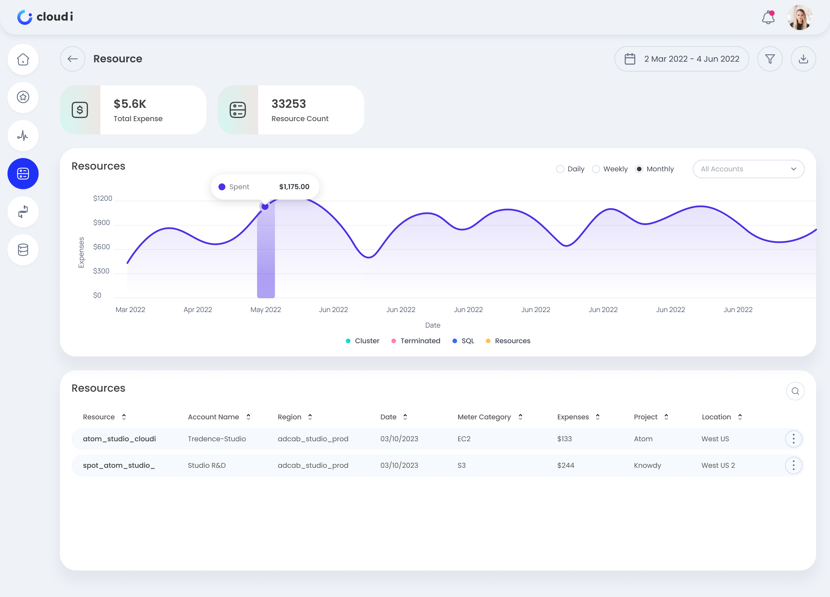
Real interface artifacts from the work.
Project artifact supplied by Savita for this case-study narrative.


01 · Context & Stakes
I designed for finance and DevOps in the same product.
I worked as the UX Designer on an enterprise B2B multi-cloud cost management platform. I partnered with a Product Manager, cloud architects, DevOps engineers, data scientists, and frontend engineers to support organizations managing $10M+ annual cloud spend.
The product needed to work across AWS, GCP, and Azure without favoring one provider.
Finance teams needed budget clarity and reporting, while DevOps needed granular resource detail.
The design had to make technical cloud data usable for non-technical stakeholders.
02 · Constraints & Risks
We cut advanced scope to protect the core workflow.
The product could have become a heavy FinOps platform quickly, so I helped the team focus on the pieces that solved the most urgent client pain with the least implementation risk.
We skipped a complex allocation rules engine and used tag-based filtering for the first release.
We deferred predictive forecasting because many clients did not have clean historical data at onboarding.
We avoided third-party FinOps integrations and built CSV and Excel export instead.
We kept the product desktop-first because cost reviews were deep analysis workflows, not mobile tasks.
03 · Research & Discovery
Cloud spend problems were being discovered too late.
I interviewed 12 stakeholders across 3 enterprise client organizations and shadowed 5 cloud administrators during live cost reviews. The workflow was fragmented, manual, and reactive.
Teams toggled between 4 to 6 dashboards to piece together cost data.
Cost anomalies were usually discovered 5 to 7 days late, often during finance reviews.
Only 18% of eligible users logged into existing cost tools because the interfaces felt too complex.
Finance teams spent 8+ hours each month consolidating data for budget reviews.
04 · Key Decisions & Trade-offs
We focused on visibility first, then guided action.
I led a 2-day prioritization workshop with Product, Engineering, Data Science, cloud architects, and finance leaders. The strategy was to create one place to understand spend, find waste, and act before overruns became month-end surprises.
Unified dashboard gave teams a single view across AWS, GCP, and Azure.
AI recommendations surfaced rightsizing, idle resources, reserved capacity, and spot-instance opportunities.
Configurable alerts helped teams catch budget spikes in under 24 hours.
Resource deep dives supported chargeback by cluster, tag, project, and job.
05 · Design Solutions
Trust came from showing the reasoning behind recommendations.
I explored a metric-heavy control panel, a simplified 3-card view, and an AI-first recommendations dashboard. Client testing showed that users needed spend context first, then recommendations they could trust. The AI recommendations became useful only when they explained the evidence. Instead of simply saying terminate a cluster, the card showed current cost, recommended cost, savings, confidence, risk, and usage pattern.
Finance users rejected the dense control panel because it created too much cognitive load.
Technical users rejected the 3-card view because it did not support project and region breakdowns.
The AI-first concept was partially adopted as a prominent savings widget on the main dashboard.
The final design balanced current spend, trends, drill-downs, and top recommendations.
Primary KPIs above the fold showed yearly cost, AI savings, spend trend, and period breakdowns.
Interactive charts let users drill into spend by time period, resource, team, and cloud provider.
Recommendation cards explained savings estimates, confidence level, risk assessment, and idle patterns.
Alerts supported budget thresholds, anomaly detection, email, Slack, and in-app notifications.
06 · Testing & Iteration
The first version hid the most valuable actions.
In Round 1 testing with 8 enterprise users, AI recommendations were too hidden, the time selector was easy to miss, and users did not realize charts were interactive. The content was strong, but the affordances were too quiet.
I moved top savings opportunities onto the main dashboard, increasing recommendation engagement from 25% to 87%.
I redesigned the time-range selector as a prominent segmented control.
I added hover states, pointer cues, and tooltips so users understood chart drill-down behavior.
Round 2 reached 100% task completion and reduced anomaly identification time to 90 seconds.
07 · Outcomes & Impact
The product shifted teams from reactive reporting to prevention.
The pilot ran across 3 enterprise clients managing $13M+ in combined annual cloud spend. The platform helped teams find savings, catch overruns earlier, and replace monthly spreadsheet reconciliation with a clearer operating rhythm.
AI recommendations helped clients achieve 40% cost savings.
Budget overruns decreased by 67% because teams caught spikes within 24 hours.
Weekly active usage increased from 18% to 85%.
Time-to-insight improved from 15 minutes to 30 seconds, and combined annual savings reached $2.1M.
08 · Reflection
Multi-persona products need shared clarity, not separate worlds.
This project taught me how to design one cohesive B2B product for both technical and non-technical users. The answer was not separate dashboards. It was progressive disclosure, plain language, and role-aware detail.
Visual hierarchy matters when technical data needs to be understood quickly by finance teams.
AI transparency drives action because users need to know why a recommendation is safe.
Unified workflows can beat best-of-breed tools when users are tired of stitching data together.
If I restarted, I would involve finance teams in Week 1 discovery instead of Week 3.
Tools and learnings
Built through craft, constraints, and handoff.
Tools
Outcomes
Cost savings reached 40% through AI recommendations
Budget overruns decreased by 67%
Weekly active usage increased from 18% to 85%
Time-to-insight improved from 15 minutes to 30 seconds