Xactly Corp 路 UX Designer 路 June 2024 - June 2025 路 B2B Enterprise SaaS
Commission Management Platform
I redesigned a high-stakes commission configuration workflow into a guided 5-step experience for enterprise finance teams.
Challenge
Enterprise finance admins spent 45 minutes configuring commission plans, and a 12% error rate triggered 680 support tickets per quarter. I needed to make a financial workflow feel safer, clearer, and faster without removing the controls finance and compliance teams needed.
67%
faster configuration time
28%
reduction in configuration errors
$2M+
annual client savings
94%
administrator adoption in 90 days
Illustrative artifacts
A product story with tangible surfaces.
These panels explain the design decisions around the supplied project surfaces.
5-step setup flow
Illustrative portfolio artifact based on the case-study narrative, not a direct client screenshot.
Configuration anxiety
Illustrative portfolio artifact based on the case-study narrative, not a direct client screenshot.
Tier logic model
Before
Spreadsheet-like rules
After
Visual tier cards with preview
Illustrative portfolio artifact based on the case-study narrative, not a direct client screenshot.
Product surfaces
Real interface artifacts from the work.
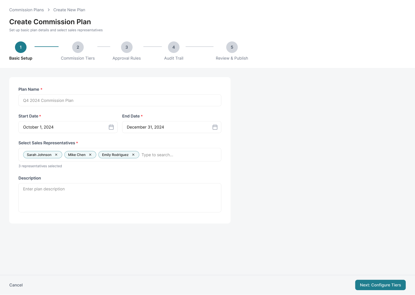
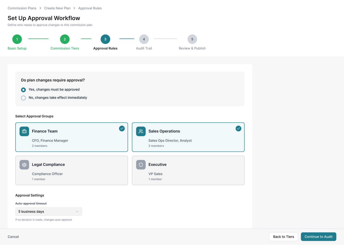
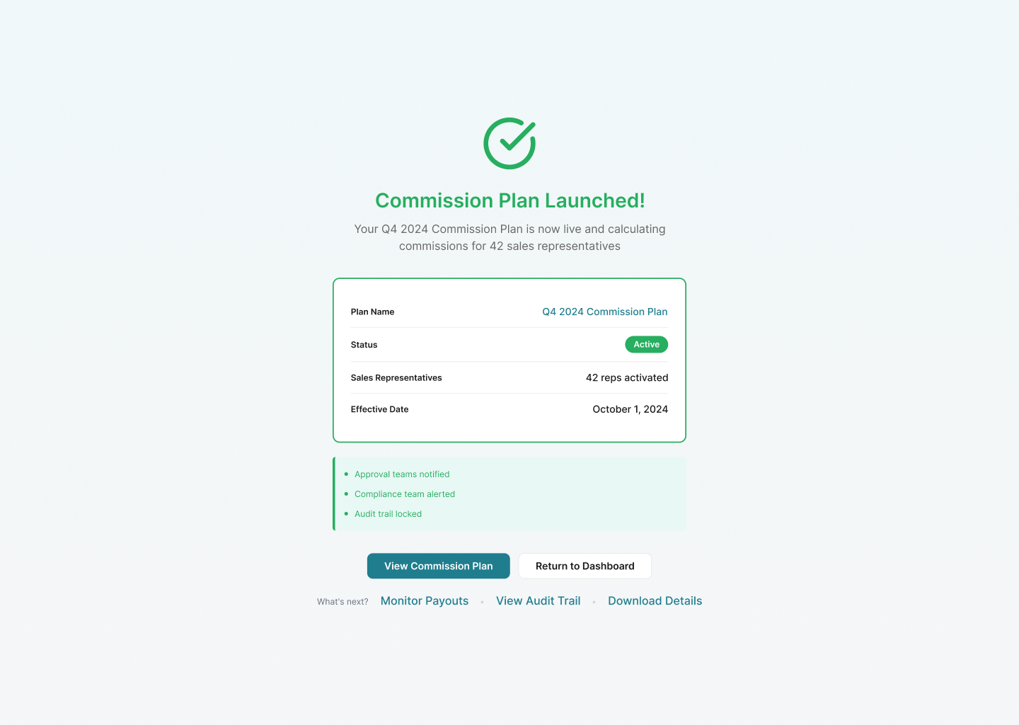
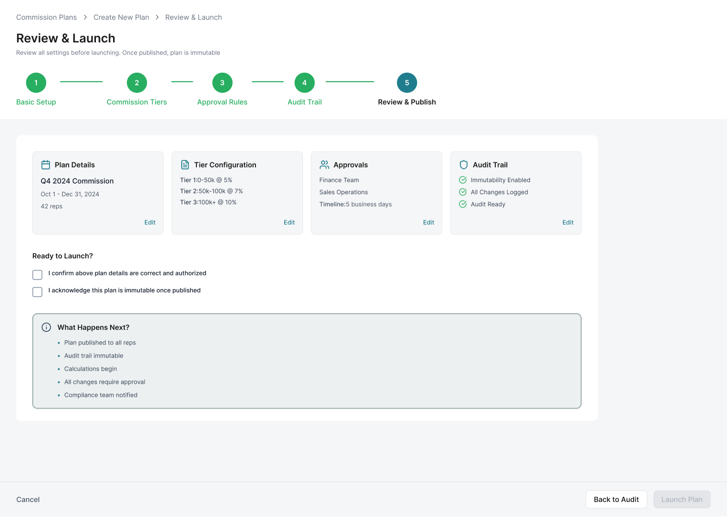
Project artifact supplied by Savita for this case-study narrative.


01 路 Context & Stakes
I redesigned a workflow where mistakes had real financial consequences.
I worked as a UX Designer from June 2024 to June 2025 on Xactly's B2B enterprise commission management platform. I partnered with Product, Engineering, finance operations SMEs, support teams, compliance stakeholders, and client finance admins.
The work focused on finance admins configuring commission plans for enterprise sales teams.
Errors affected payouts, sales team trust, audit readiness, and support volume.
The redesign had to balance speed for power users with guardrails for novice admins.
02 路 Constraints & Risks
We cut ideas that slowed the core job down.
Several ideas looked useful, but the research showed they would pull attention away from the main workflow. I used support ticket data, client ROI projections, and engineering estimates to keep the scope focused.
We did not build AI plan recommendations because admins wanted control before automation in a high-stakes financial workflow.
We deprioritized mobile because fewer than 2% of client sessions happened on mobile.
We skipped batch plan editing for Phase 1 and added duplicate plan shortcuts instead.
We avoided an advanced analytics dashboard because clients already used BI tools and needed action-oriented configuration support.
03 路 Research & Discovery
Finance admins were anxious because the product made them guess.
I interviewed 15 stakeholders, tested the existing workflow with 12 client users, reviewed 1,200+ support tickets, and analyzed heatmaps, drop-off points, and error patterns. The same theme kept coming up: users did not feel confident until payroll exposed mistakes.
Users spent 45 minutes on average configuring one commission plan.
31% abandoned the workflow midway or called support.
12% of published plans had errors that were often discovered only when payroll ran.
Users opened help docs 18 times on average per session.
04 路 Key Decisions & Trade-offs
We organized the work around confidence, not just speed.
I led a 3-day workshop with Product, Engineering, finance SMEs, and client stakeholders. We turned the research into a focused redesign strategy: make the logic visible, validate early, and give admins a clear path to review and approval.
The final structure used 5 steps: plan details, tier structure, calculation rules, validation, and review.
The 5-step model tested better than 3-step and 7-step versions because it balanced progress with manageable chunks.
Real-time validation and preview became trust-building features, not just error handling.
Compliance needs made audit trail, approval visibility, and immutable logs non-negotiable.
05 路 Design Solutions
The design made commission logic visible.
I explored a single-page smart form, a 7-step wizard, and a template-first approach. The final direction combined a guided 5-step flow with tier cards, validation, calculation preview, and approval transparency. The biggest mental-model shift was from abstract attainment rules to visual tier cards. Finance admins could finally see the ranges, rates, gaps, overlaps, and payout previews before publishing.
The smart form still felt overwhelming because users did not know where to start.
The 7-step wizard created too many clicks for simple plans.
Generic templates felt limiting because every client's compensation structure was different.
Duplicate existing plan became the practical shortcut that solved most repeat-work use cases.
Tier cards matched the way users described commission logic: if sales hit a threshold, pay a rate.
Real-time validation surfaced gaps and overlaps as users worked instead of waiting until publish.
The calculation preview showed low, mid, and high attainment scenarios with expected payouts.
Approval views showed status, owner, timeline, and change history for audit readiness.
06 路 Testing & Iteration
The first version still hid the most important reassurance.
In Round 1 testing with 12 finance admins, Step 3 was too dense, drag-and-drop tier reordering caused mistakes, and only 3 of 12 users noticed the preview panel. The interface had the right ingredients, but not enough guidance.
I added contextual examples for rate and multiplier fields, reducing time on Step 3 from 8 minutes to 3 minutes.
I replaced drag-and-drop tier reordering with arrow buttons and visual feedback, eliminating accidental deletions.
I made the preview panel more prominent, and 11 of 12 users engaged with it in Round 2.
Round 2 reached 100% task completion, and all 8 users said they would use it over the old system immediately.
07 路 Outcomes & Impact
The redesign reduced support load and made publishing feel safer.
The pilot with 30 finance teams showed that the guided flow improved speed, accuracy, and trust. The work also helped compliance teams prepare for audits with less manual effort.
Configuration time decreased from 45 minutes to 15 minutes.
Error rate decreased from 12% to 8.6%.
Support tickets decreased from 680 per quarter to 355 per quarter.
NPS increased from 62 to 92, and audit prep time decreased from 8 hours to 45 minutes.
08 路 Reflection
Enterprise clarity comes from matching the user's mental model.
This project taught me that complex B2B tools do not need to feel simple by removing complexity. They feel simple when the structure matches how users already think about the work.
Progressive disclosure works best when it follows decision type, not database structure.
Preview is the trust lever in high-stakes workflows because users want to see outcomes before committing.
Visual metaphors can make abstract rules easier to verify.
If I restarted, I would involve compliance stakeholders in Week 1 instead of Week 4.
Tools and learnings
Built through craft, constraints, and handoff.
Tools
Outcomes
Configuration time decreased by 67%
Error rate decreased by 28%
Support tickets decreased by 48%
First-time success increased from 60% to 87%